
ABSTRACT · 摘要
This is the development log of tokenbridge.dev: a designer discovered the missing design-system context in AI coding tools, then single-handedly defined, designed, and shipped a visual design system builder — one that compiles colors, typography, spacing, and component rules into AI-readable skill packages, so that tools like Cursor and Antigravity generate code that matches the design intent. The article retraces problem definition, positioning and naming, the color system, style and theme presets, compilation and export, and the solo build — part methodology, part hands-on engineering practice.
KEYWORDS · 关键词
In my previous essay on physical versus digital products, I wrote — in the section on the engineering view — that Design Tokens parameterize design, turning design language into keys and values in engineering files. Back then it was a footnote in a methodology. Two years later, as AI coding tools pushed the cost of writing code toward zero, that footnote became the most painful bottleneck in my daily work — and the starting point of a product called tokenbridge.dev.
If the previous article was a purely theoretical comparison, this one is a field report pressed out of a real product: how the problem was defined out of one concrete frustration, how the solution was narrowed version by version, and how a designer used AI tools themselves to ship a product that teaches AI to understand design.
01The Problem: AI Lacks Not Ability, but Context
In 2025, like many designers, I went deep on AI coding tools such as Cursor. They are genuinely powerful — a sidebar, a dashboard, a few sentences, and it runs. But hand it a page with any brand requirements and the result is always the same shape: technically workable, designed all wrong. The primary color is its guessed blue, the radius its habitual 8px, spacing drifts, and the component patterns bear no relation to my rules. Every AI-generated component became a manual correction task.
At first I blamed my prompts. So I pasted hex values, type scales, and spacing rules into the context — it worked, but re-pasting dozens of constraint lines every session was fragile and impossible to accumulate. Eventually I realized this was not a phrasing problem but a structural one: what AI coding tools lack is not generative ability but design-system context. Without context, the AI can only produce the interface that is “statistically most interface-like”; with context, it can produce mine.
Every AI-generated component becomes a manual correction task — unless you teach it your design system first.
This is the core tension of the Vibe Coding paradigm: developers chase the instant injection of intent — express it in a prompt, and AI realizes it at speed. But intent expressed only in natural language is a blurry signal; only when structured into precise constraints can AI execute it reliably. Design, conveniently, already owns such a vehicle of structure — the Design Token. The problem was now well defined: how can a designer’s design system become context that AI coding tools can read and obey?
02Positioning & Naming: Encoding the Vibe into Tokens
2.1Not Competing with Legacy Tools
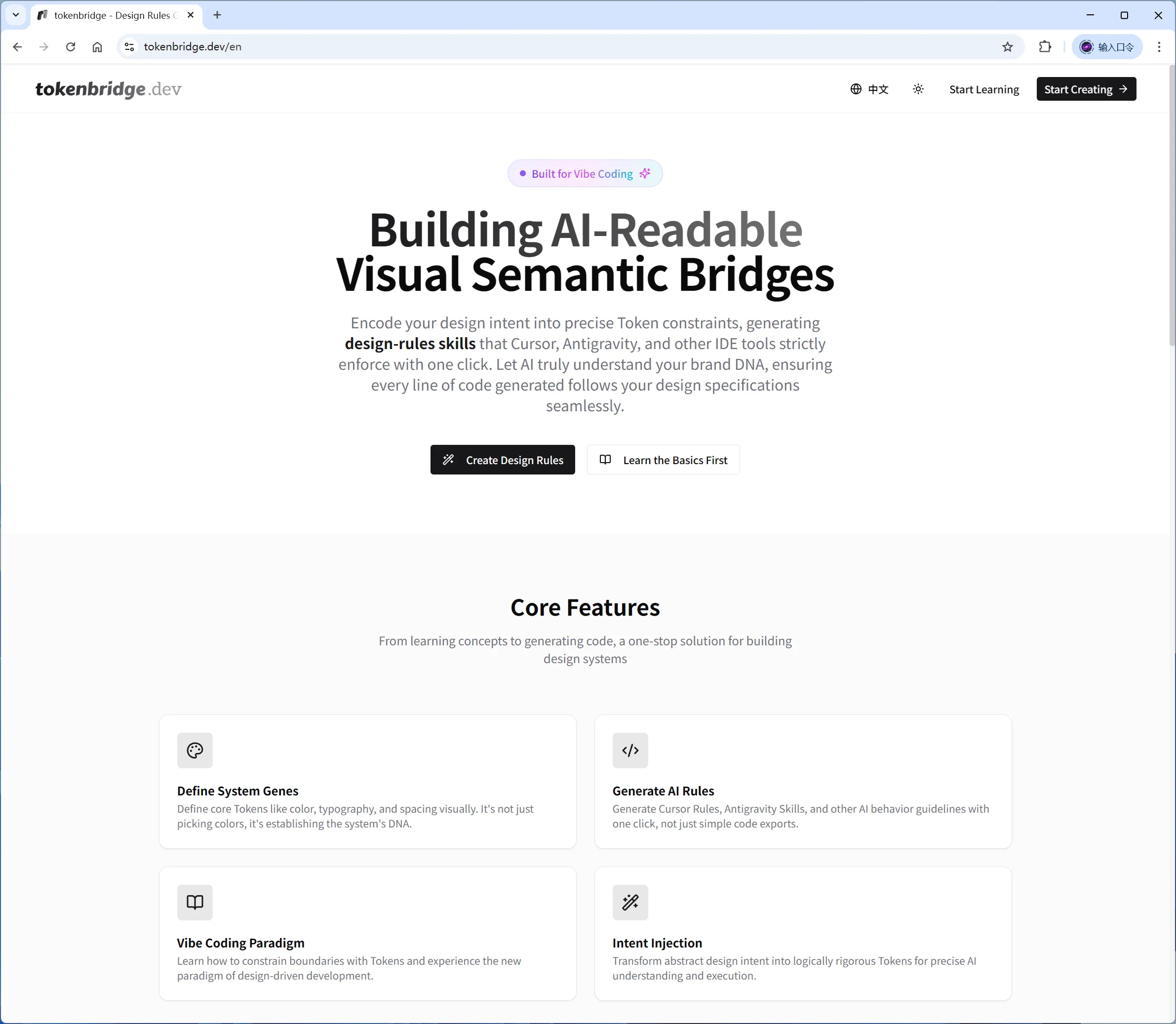
Design-token tooling is not new — Tokens Studio and UXPin are mature. But look closely: their audience is designers, their output is code snippets and JSON, their interaction model is static documentation, and their workflow is design-driven code. In the new AI-coding pipeline, the truly hungry audience is someone else: vibe coders and indie developers with extreme demands for brand consistency. What they need is not a list of tokens but a code of conduct for AI — rule files that can be injected dynamically and obeyed natively by the tool. A new category thereby stands: the design-intent encoding tool.
2.2The Name Is the Manual
The name tokenbridge.dev is a pun. Token is both the official term of the W3C Design Tokens standard — the encoding of design intent — and the minimal unit of an AI’s runtime logic; Bridge is the channel through which intent is understood before AI generates code. Stacked together, the two meanings describe exactly what the product does: turning abstract design into a token stream that AI can understand. The domain is the manual — users know what it does the moment they read the name, which is the cheapest user acquisition an indie developer can get.
The tool, as the parent brand, is tokenbridge; its deliverable — the zipped skill package — is named design-rules. “Design” defines the scope; “Rules” defines the attitude: it tells the AI that this is not merely styling — this is a logical boundary. The user’s mental model is simple: I am laying down rules for my AI. The slogan followed naturally: Token your Design Vibe, Bridge to AI Code.
Token is the encoding of design intent; Bridge is the channel of understanding — the name is the manual.
03The Color System: A 24-Token Dual-Mode Architecture
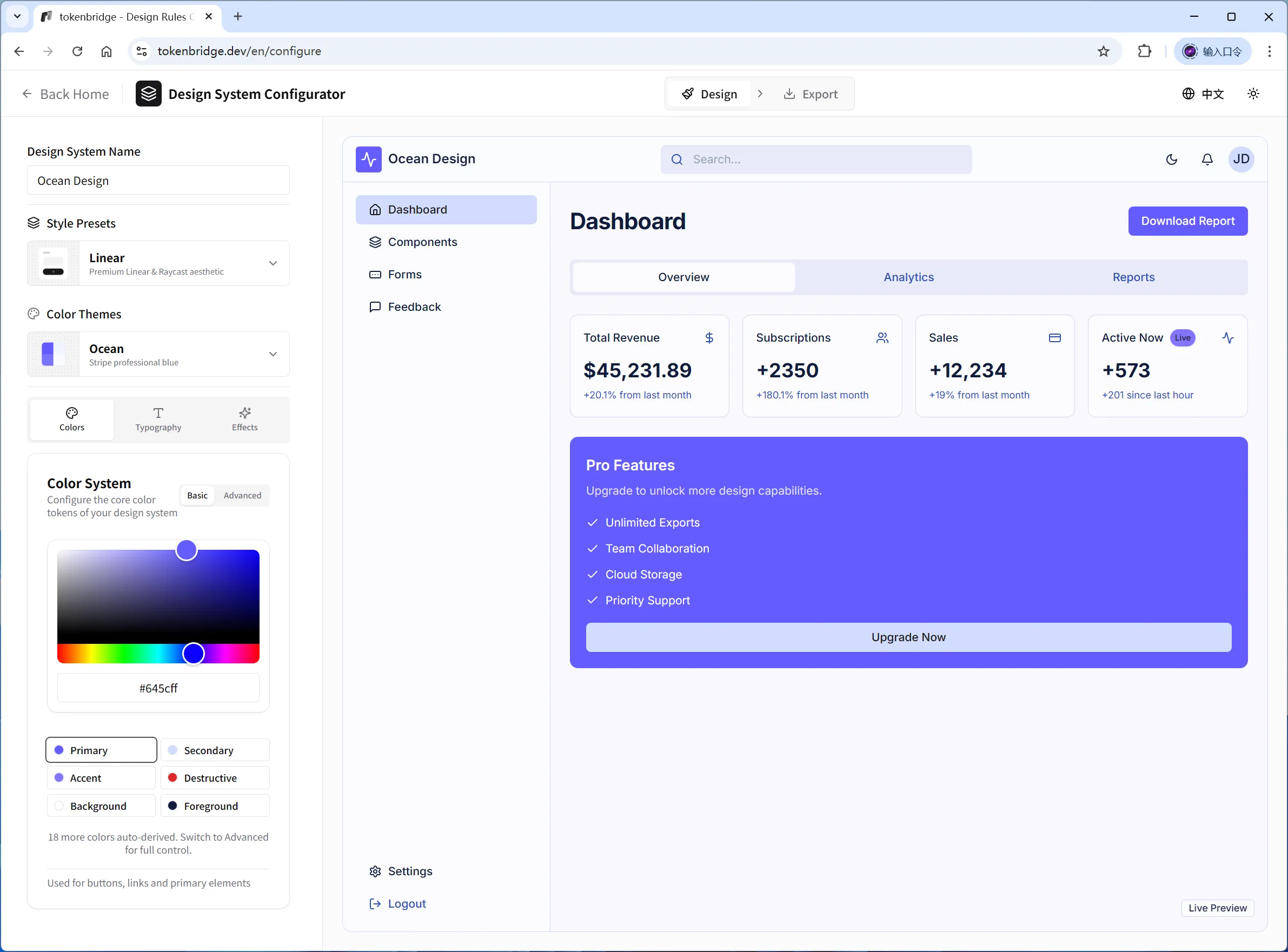
Color is the deepest water in a design system. The first configurator had only 14 color tokens, exposed just 7 in the UI, and had neither derivation logic nor semantic state colors — every theme required tedious hand-tuning of near-duplicate shades. In version 0.5 I rebuilt it entirely, upgrading the token architecture to a 24-color dual-mode system.
The core idea is a derivation chain. In basic mode, the user configures only 6 core colors; the remaining 18 are generated by the derivation engine: every foreground color is computed against WCAG AA contrast to keep text legible; container colors such as Card, Popover, and Muted derive from the background; Border and Input darken the background by 10%, and Ring simply equals Primary; the semantic states — Success, Warning, Info — use preset values consistent across themes. Dark mode is not a naive inversion but an intelligent luminosity reversal that flips lightness while preserving the hue and recognizability of brand colors. Advanced mode unfolds all 24 tokens for fine-tuning; once the user manually edits a derived color, a lock mechanism remembers it, so later changes to core colors never overwrite it.
Behind this design lies a methodological judgment: defaults are design decisions. A configurator should not throw 24 coloring questions at the user; it should compress them into 6 fill-in-the-blanks and let validated derivation rules handle the rest. A designer’s professional value lives precisely in these invisible default rules.
04Style × Theme: A Two-Dimensional Preset System
Before 0.5, presets were single-dimensional — each preset bundled colors with radii and shadows, so switching colors meant switching every stylistic decision too. The upgrade split them into two independent axes: style presets govern border radius, shadow intensity, density, button size, and input style; color themes govern color alone. Chosen independently and combined freely, 6 × 6 yields 36 ready-made starting points.
How is preset quality guaranteed? My answer: reference is the best quality control. Each of the 6 styles has an explicit design-language benchmark — Default follows shadcn/ui’s neutrality, Soft borrows Apple HIG’s roundness, Sharp comes from IBM Carbon, Linear replicates Linear.app’s modern feel, Brutalist is Swiss-International high contrast, and Playful is Duolingo-scale radius. The 6 color themes do the same: Graphite benchmarks Vercel, Ocean benchmarks Stripe, Emerald benchmarks Robinhood, Violet benchmarks Framer, Coral benchmarks Airbnb, and Amber benchmarks Duolingo. Every theme obeys three principles: foreground-background pairs meet WCAG AA; dark mode is tuned independently rather than simply inverted; semantic state colors keep consistent meaning across all themes.
A good preset does not decide for the user — it turns the design language of mature products into a one-click starting point.
05Compile & Export: Turning a Design System into an AI Skill Package
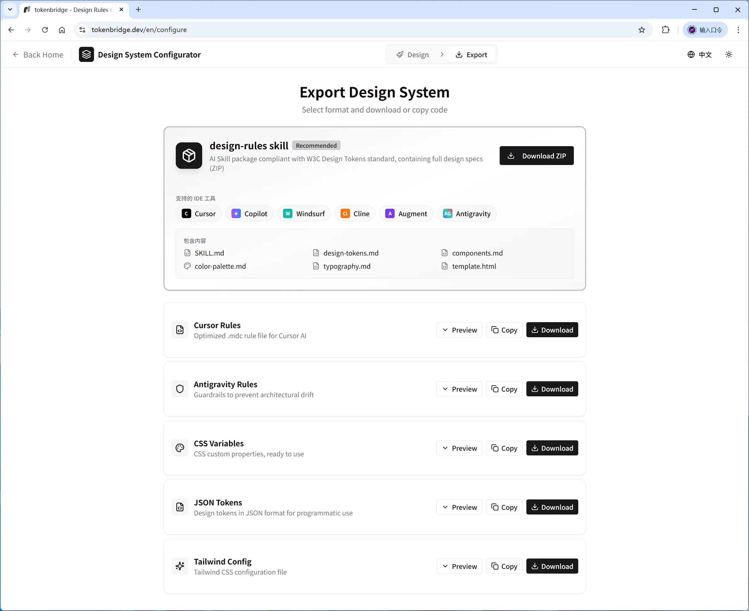
Configuration is only the first half; export is where the product wins or loses. The whole app is a pure front-end architecture — no backend API, everything generated in the browser. Tokens are compiled through a Handlebars template engine and zipped by JSZip, producing 6 formats: Design-Rules Skill (.zip), Cursor Rules (.mdc), Antigravity Rules (.md), CSS Variables (.css), JSON Tokens (.json), and Tailwind Config (.ts).
The recommended one is the Design-Rules Skill. It is not a stylesheet but a structured skill package: the main document SKILL.md teaches the AI the whole design system; the references directory holds design-token documentation, component specs, palette, and typography for on-demand lookup; and an HTML preview template in assets lets the AI see the target effect before generating. The difference from legacy tools is essential: the output changes from code snippets to AI codes of conduct, the interaction changes from static documentation to dynamic prompt injection, and the workflow changes from “design drives code” to “AI drives implementation, tokens bound the edges.”
06Building Solo: Building the Bridge with AI
6.1A Self-Proving Build
This project carries a natural self-proof: it was built entirely with the tools it supports — Cursor and Claude Code generated much of the code, Vercel handles deployment, and I owned problem definition, system design, product decisions, and final quality. The stack is Next.js 15 + React 19 + TypeScript; state is managed with Zustand and persisted locally with versioned migration, so user configurations survive upgrades; the interface uses Tailwind and Radix components; next-intl powers the bilingual Chinese-English routing.
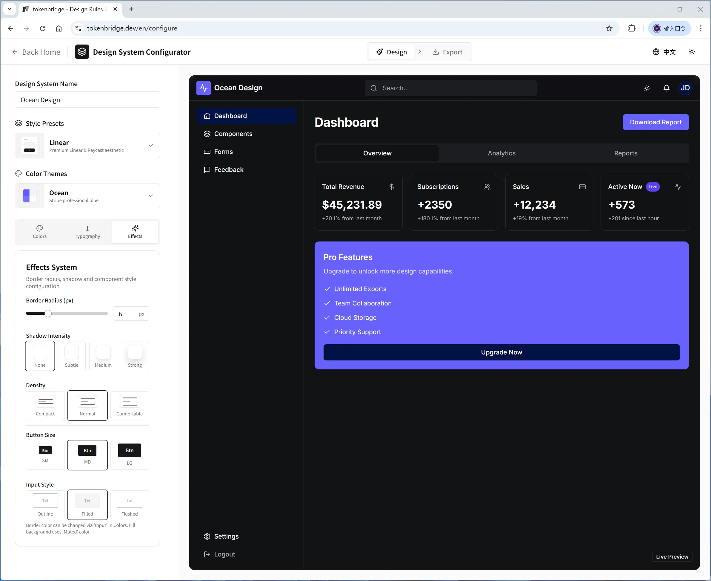
The engineering details of human-AI collaboration are worth recording too: color configuration debounces at 16ms to keep dragging at 60fps; the preview area injects the 24 colors and style tokens as CSS variables in real time, fully isolated from the app’s own styling, with light and dark previewed independently; four preview views — dashboard, components, forms, and feedback — let users see tokens performing in real interfaces before exporting.
6.2Cadence and Launch
The changelog faithfully records how the product narrowed: 0.3 unified the skill package name as design-rules, adopted the tokenbridge.dev domain and logo, and established the changelog itself; 0.4 added the homepage cases module, favicon and OG images, SEO work, and split the learning center into its own route; 0.5 was the configurator’s major update — the 24-color dual-mode system, 6 style presets, 6 color themes, and a fuller effects system. The product also ships a 7-lesson learning center for developers new to design systems.
The product is publicly live at tokenbridge.dev with complete documentation and a bilingual interface. As of January 2026, the full Product Hunt launch kit — tagline, product description, screenshots, and demo assets — has been prepared. From the first line of code to a ready-to-launch kit, there was never a second team member.
Build the bridge with AI — then let AI build better with the bridge.
07Epilogue: From One Practice to a Method
In retrospect, the project validated several reusable methods: problem definition precedes solutions — the judgment that “design context is missing” set the product’s ceiling earlier than any feature design; defaults are design decisions — derivation rules and preset benchmarks deposit professional ability where users cannot see it; context engineering is the designer’s new lever — when AI takes over implementation, the most valuable thing a designer can deliver shifts from the interface itself to the rules that bound it.
In my previous article on physical and digital products, I called Design Tokens the seam between the design system and the engineering system. tokenbridge.dev extends that line: when the executor of the engineering system changes from human to AI, the seam must upgrade from “specs for people to read” to “rules for AI to obey.” The next stop for design systems is making machines their first readers. As for the road beyond — a Figma plugin, token import, team collaboration — see you in the changelog.
REFERENCES · 参考与引用
- [1]W3C Design Tokens Community Group — the Design Tokens standard
- [2]Andrej Karpathy — coining and defining Vibe Coding
- [3]shadcn/ui — component system and style-preset reference
- [4]Design Systems: A Systematic Approach to Digital Product Design — Alla Kholmatova (UK)
- [5]tokenbridge.dev — project source and documentation (MIT License)
TOOLS USED · 构建工具
- Cursor · Claude Code
- The project’s main code-generation and pair-development tools — and the target runtime for the design-rules skill package.
- Antigravity
- An AI coding tool whose Rules format prevents architecture drift — one of the six export formats.
- Vercel
- The deployment platform behind tokenbridge.dev’s launch and iteration.