
Industry
Brand Design / Cloud Services
Role
Brand Designer

BRAND SYSTEM
Build an expandable visual foundation for cloud services
Frey Cloud began with a foundational question: for a cloud-product brand built to expand, an identity cannot remain a static graphic. It needs to become a visual grammar that can organize products, services, and touchpoints. Starting with the primary mark, the work builds a complete system across core form, supporting language, sub-brands, and applications.
The goal was not to add a superficial layer of technology. It was to give the cloud-service qualities of connection, composition, and continual evolution one recognizable order across digital interfaces, physical space, and new product names.
01 / BRAND CORE
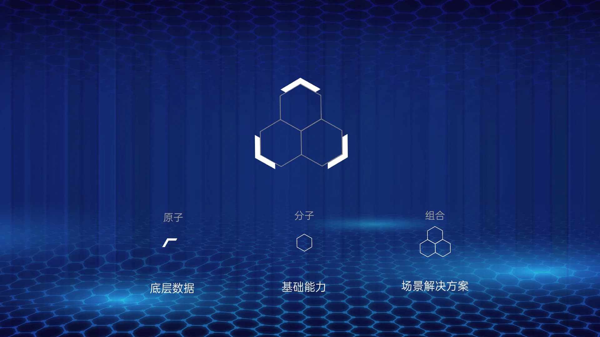
Build the primary mark from atom to molecule to composition
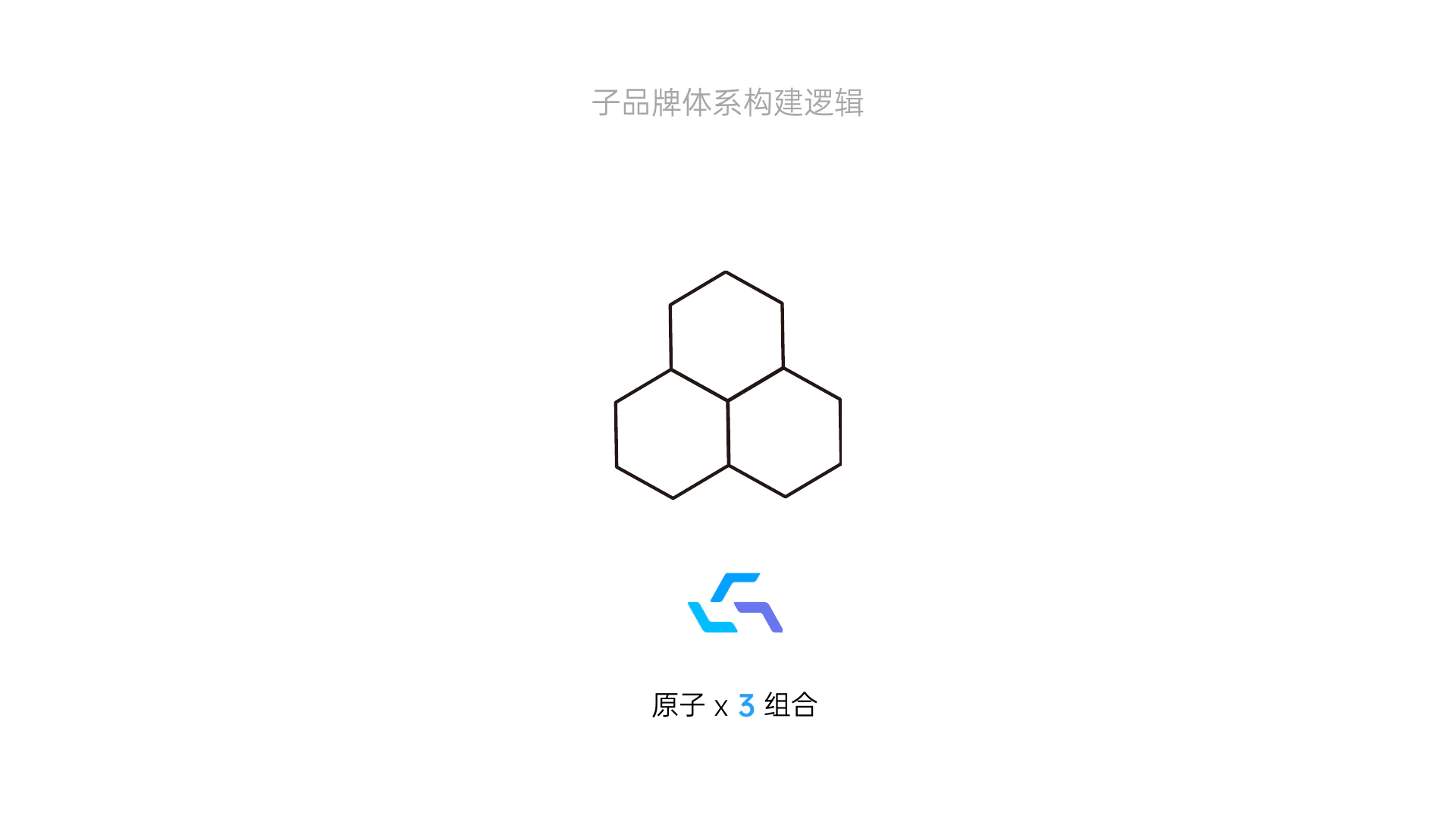
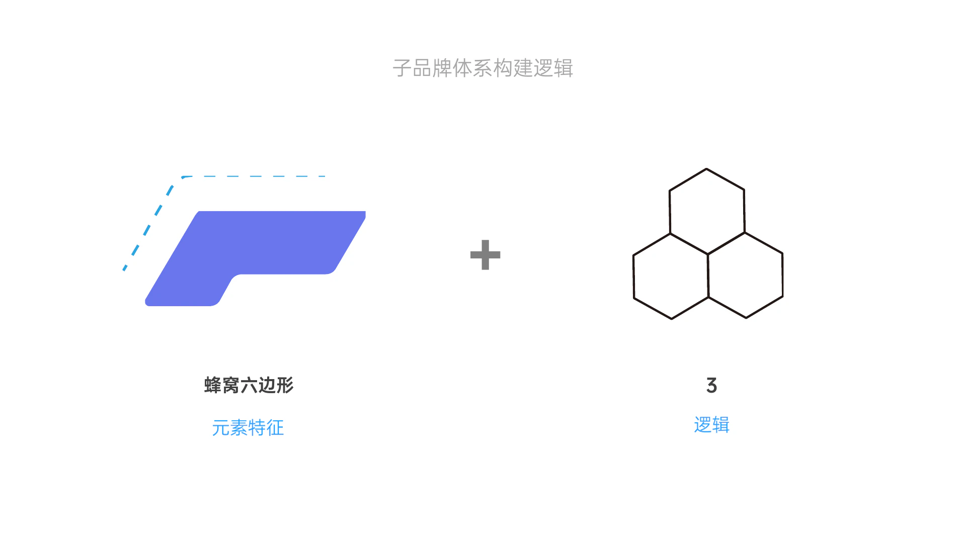
The primary mark starts with a minimal atom-like unit. Direction, distance, and aggregation turn those units into molecules, then into a recognizable whole. This construction gives the form both a stable center and an open capacity to grow: it works as Frey Cloud's core symbol while setting rules for future products and services.


02 / VISUAL LANGUAGE
Build a visual language of flow, connection, and order
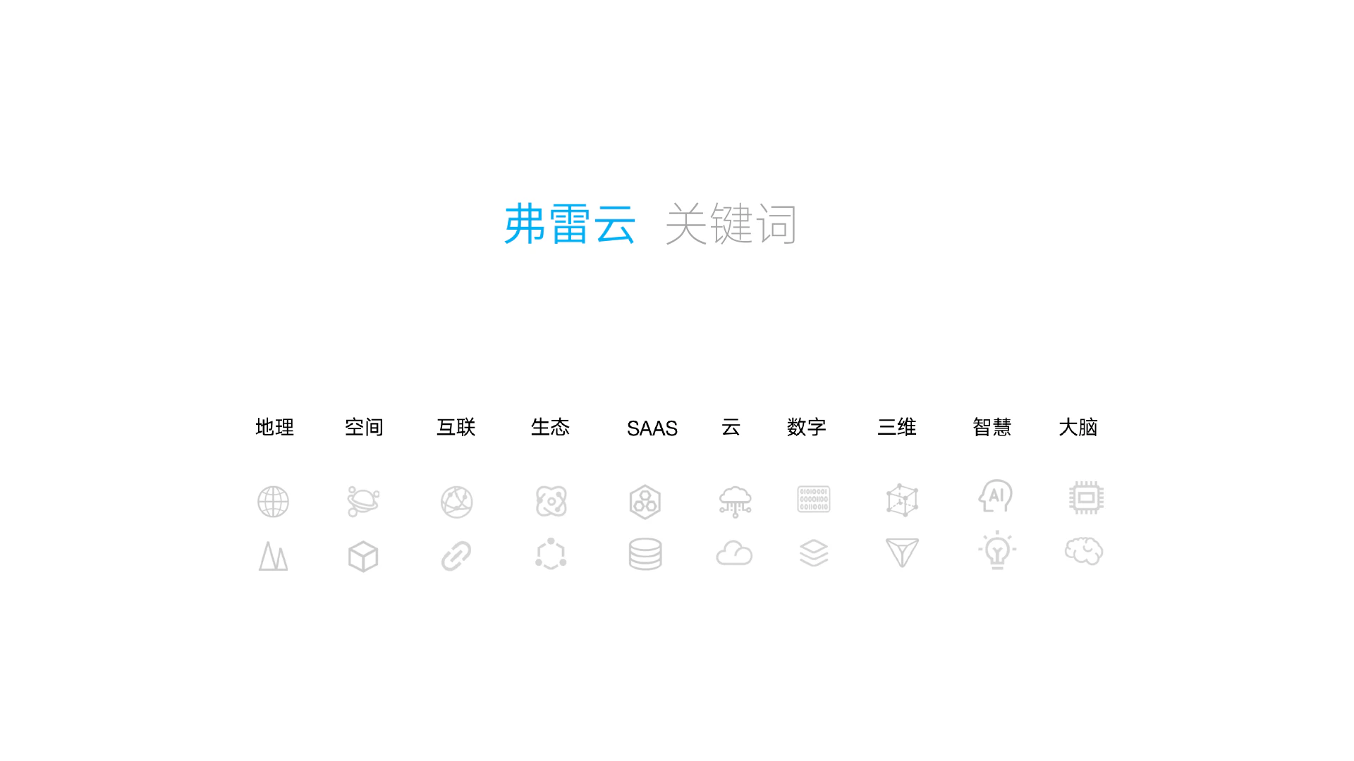
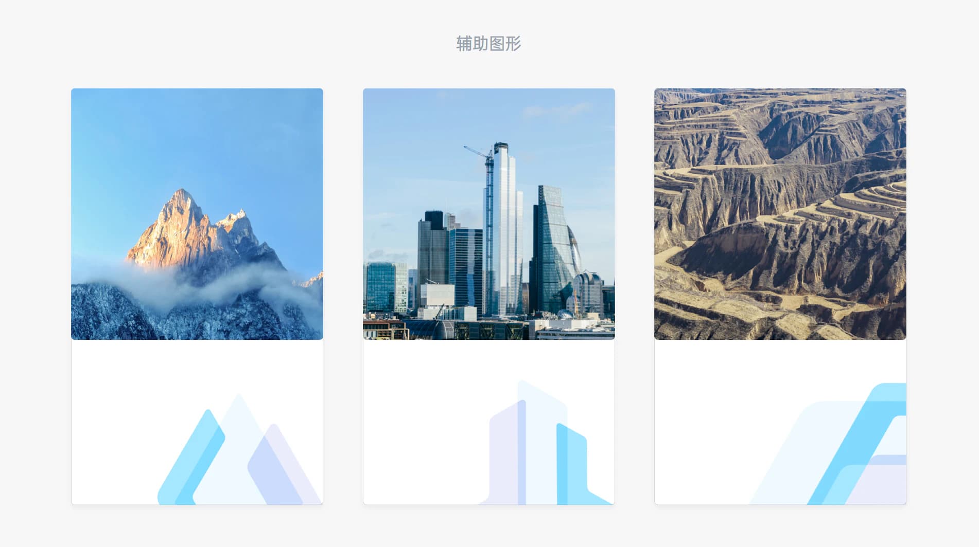
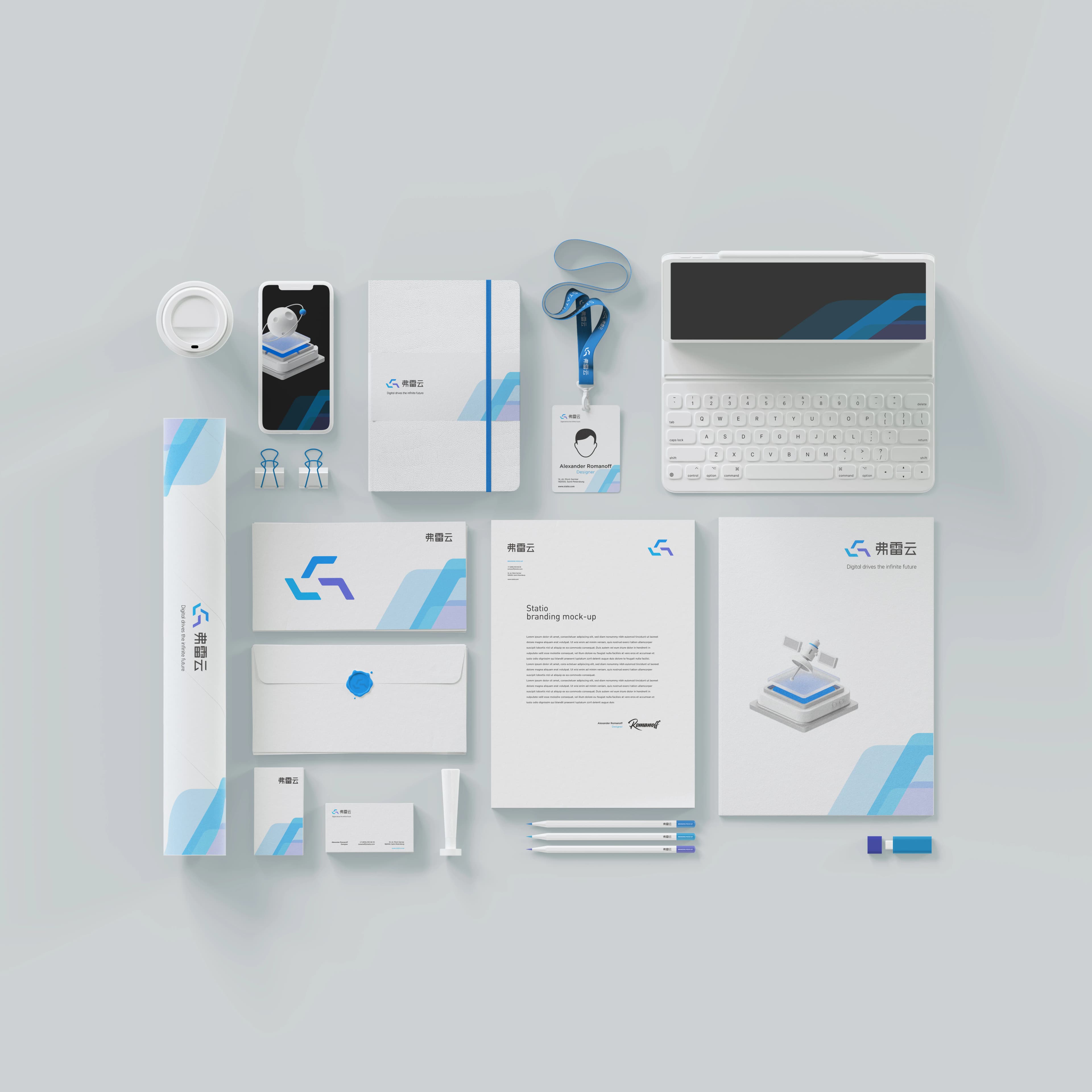
Blue and violet establish a technical, trusted base. Continuous curves and geometric modules make abstract cloud connection perceptible as visual rhythm. Supporting graphics are not extra decoration; they extend the composition logic of the mark across the website, campaign imagery, and digital content, so different layouts remain organized by one brand grammar.


03 / SUB-BRAND SYSTEM
Make the primary mark a shared grammar for sub-brands
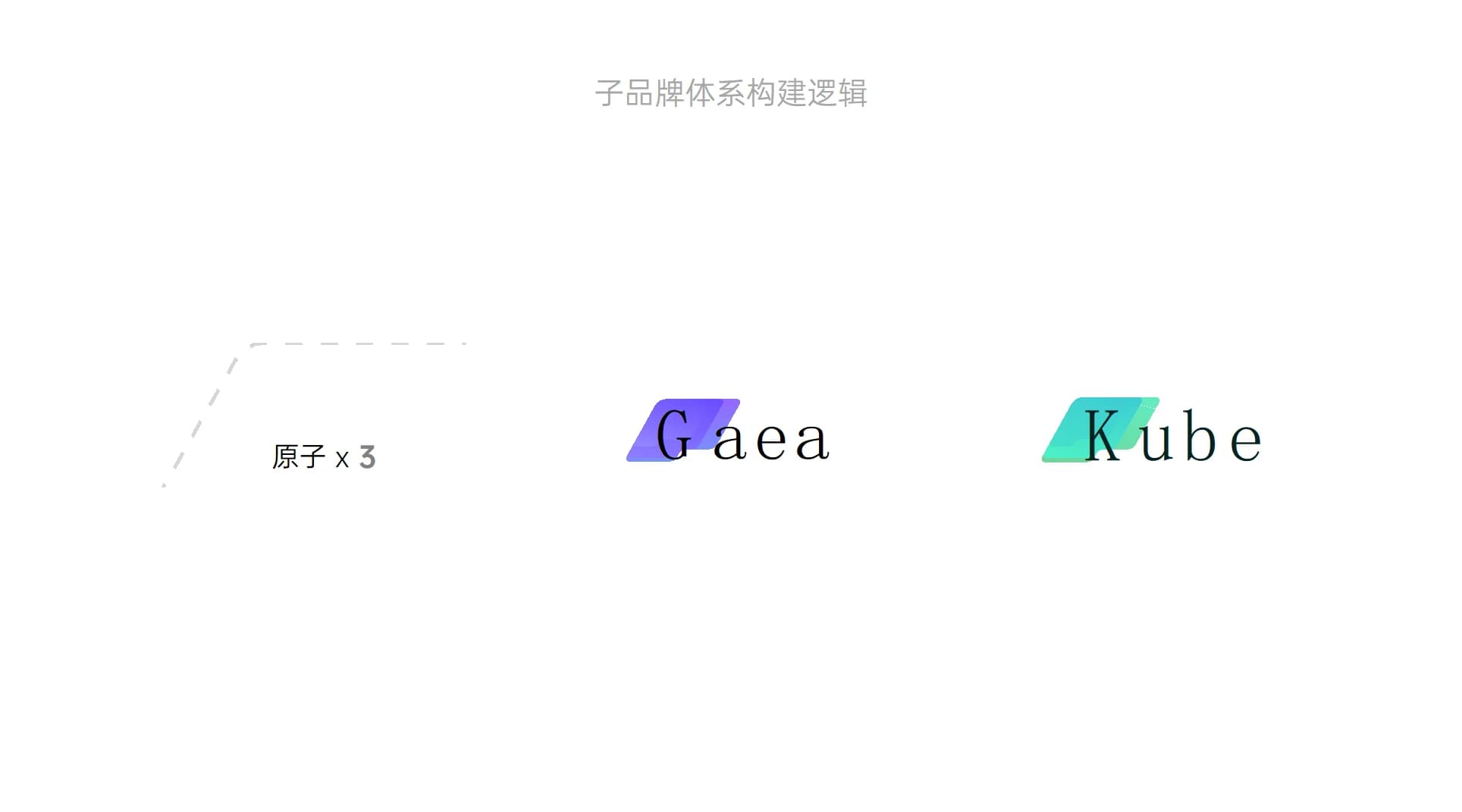
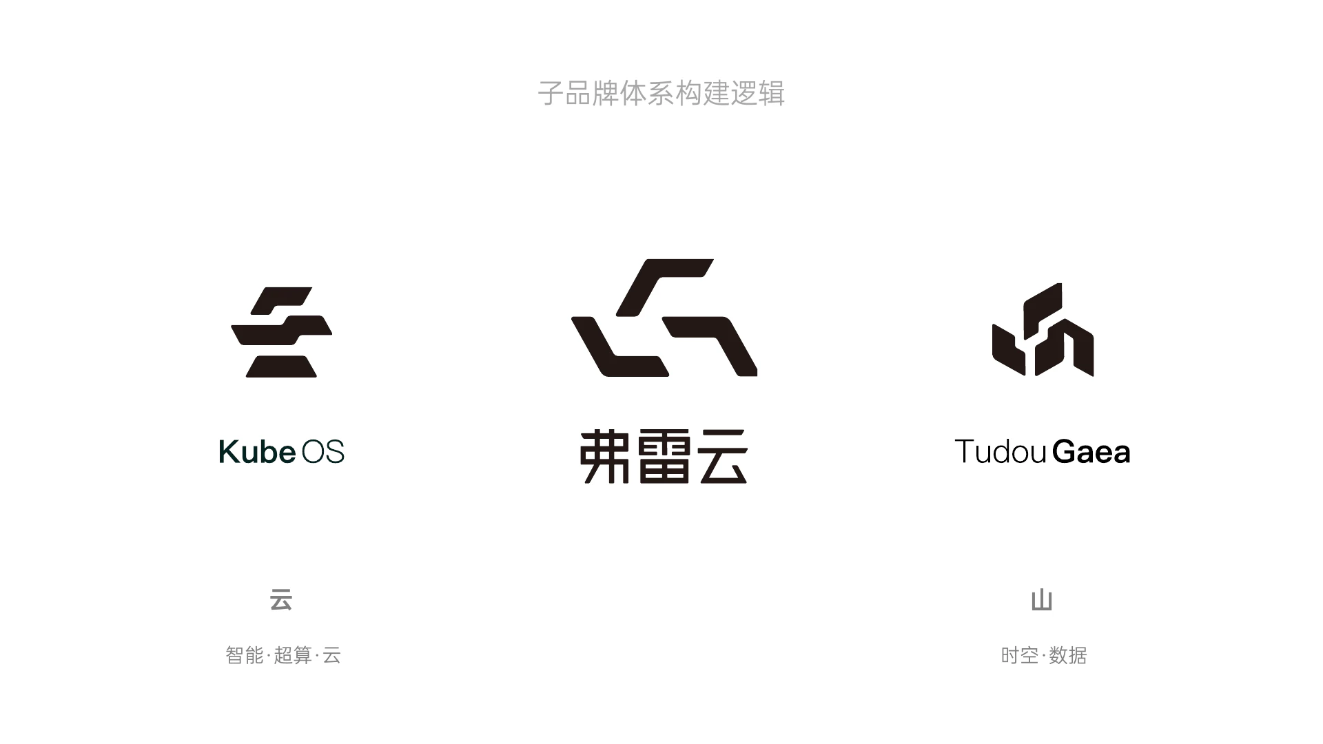
Kube OS and Tudou Gaea are not treated as isolated logos. They grow from the same atom and composition rules. The master brand supplies a stable identity gene, while each sub-brand gains distinction through its own graphic combination, naming relationship, and context of use. The architecture stays coherent while leaving room for the product line to grow.


04 / APPLICATION VALIDATION
Test the system across digital, spatial, and everyday touchpoints
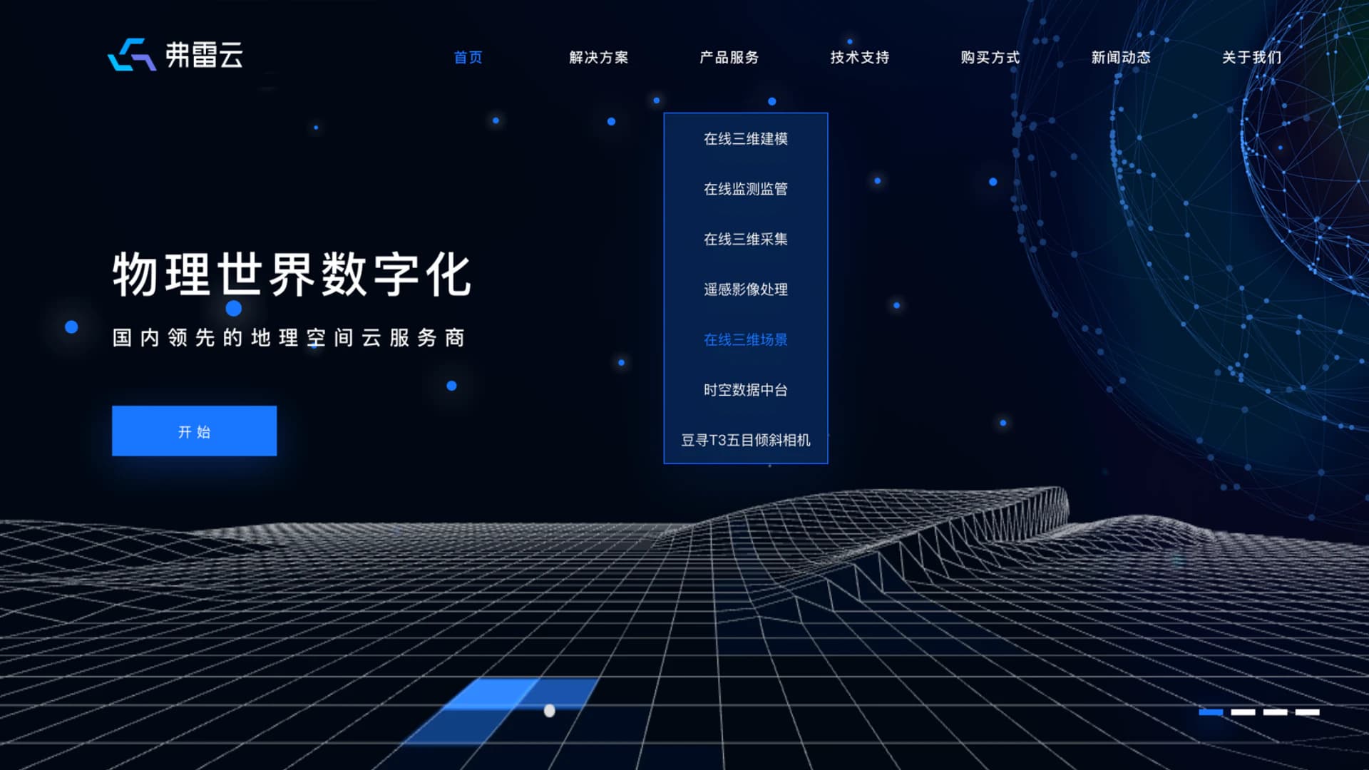
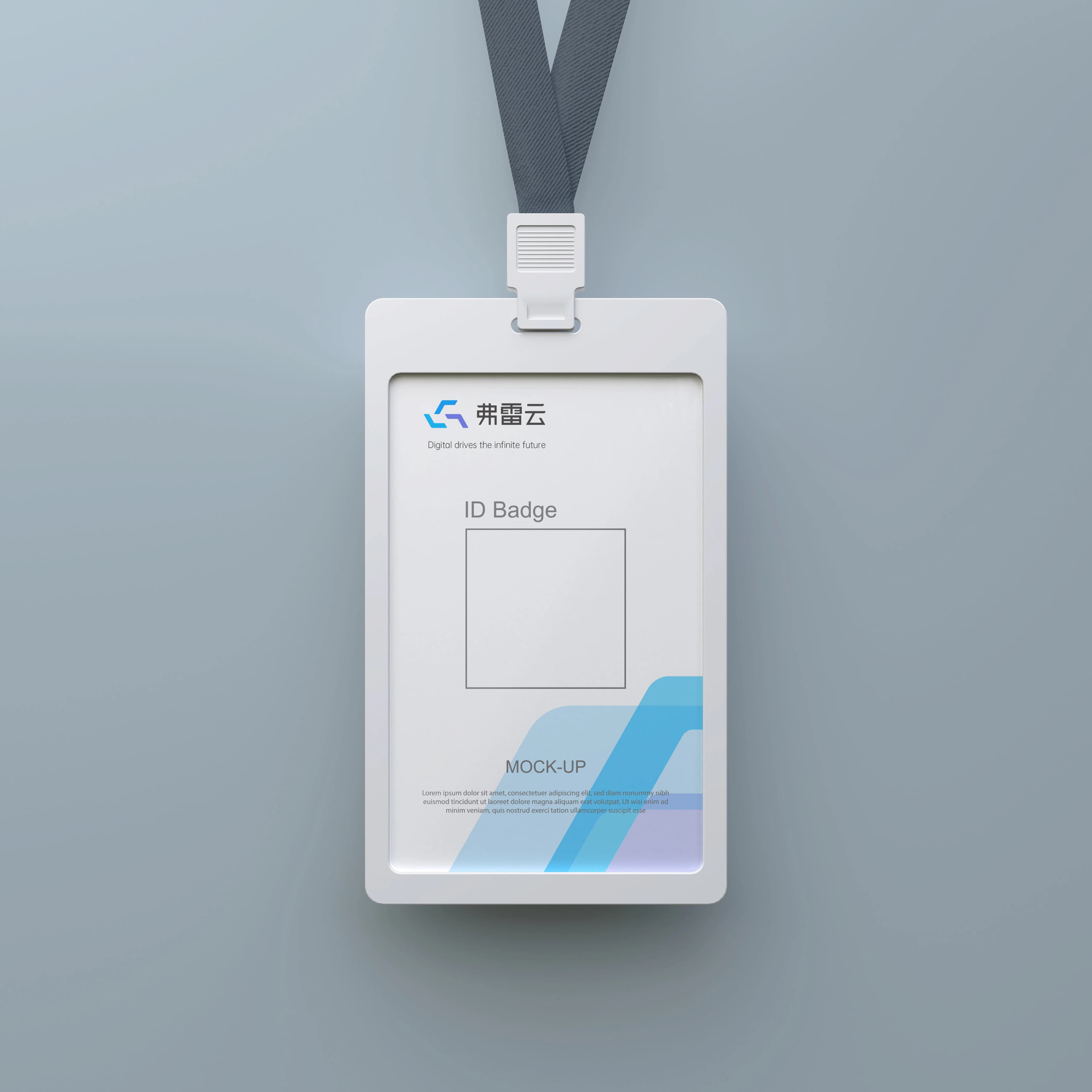
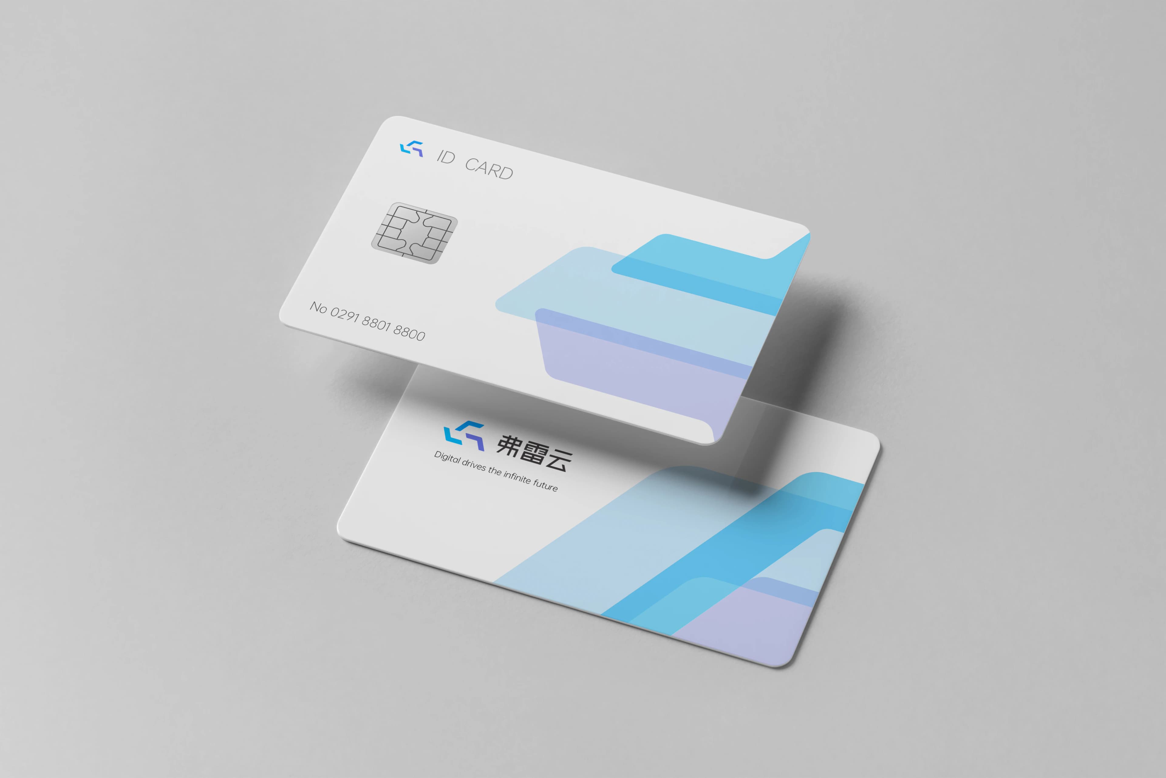
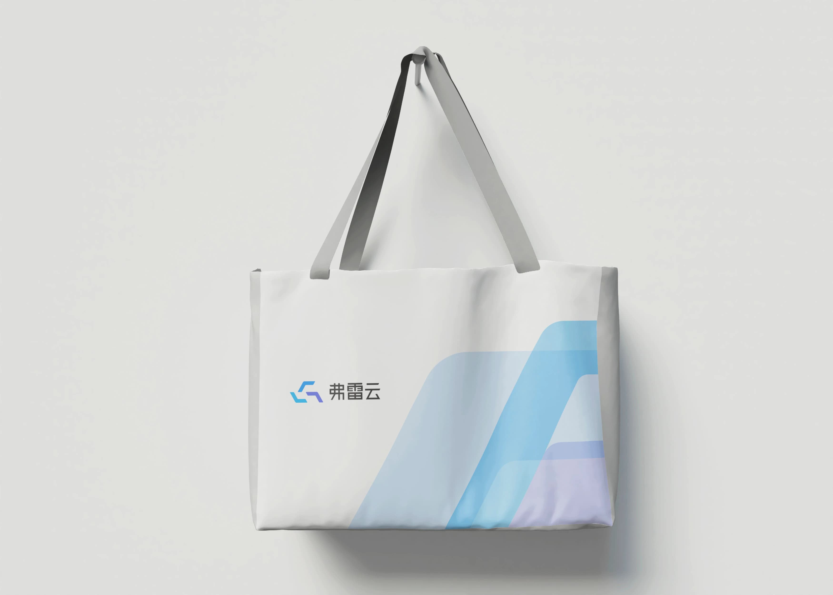
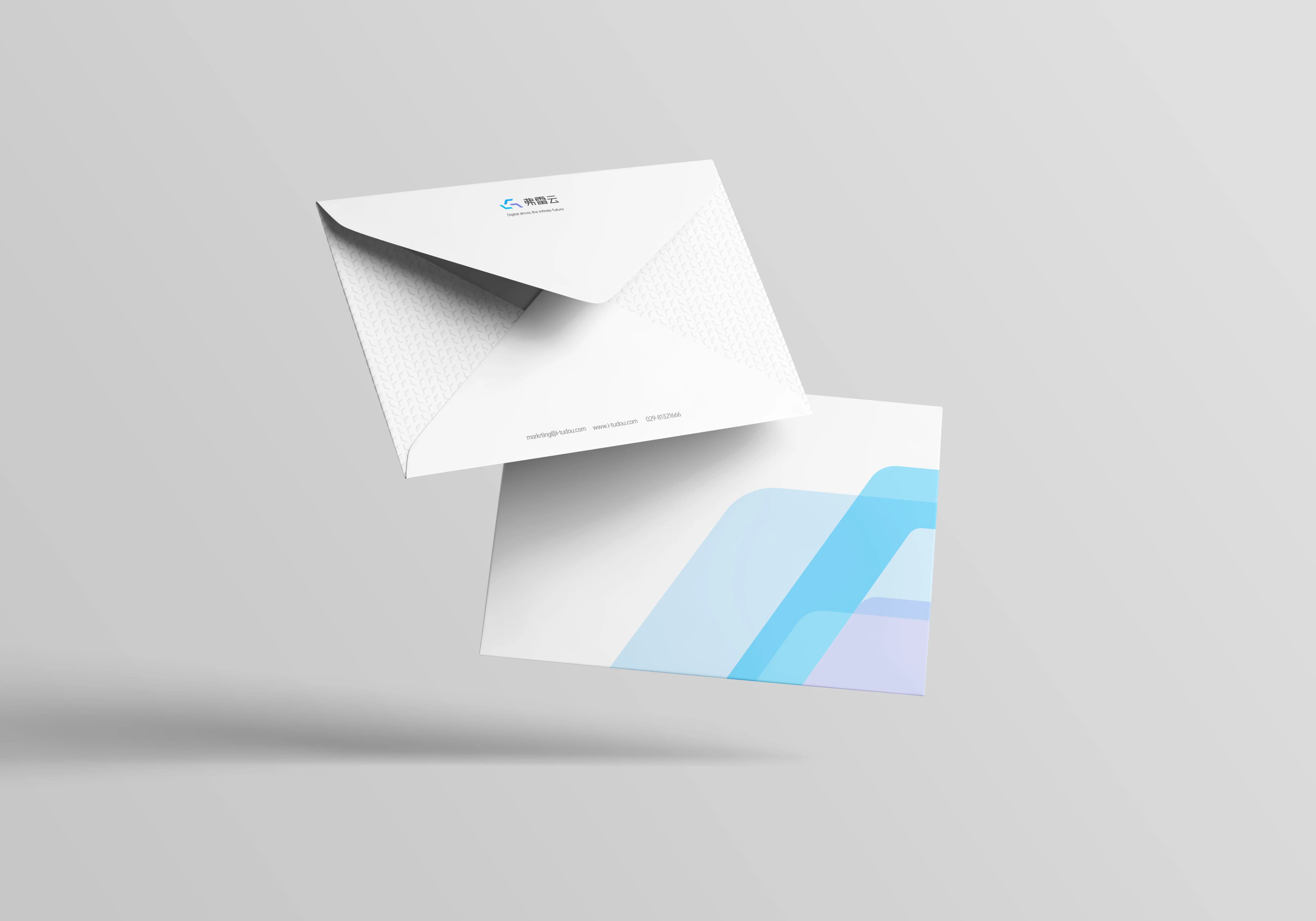
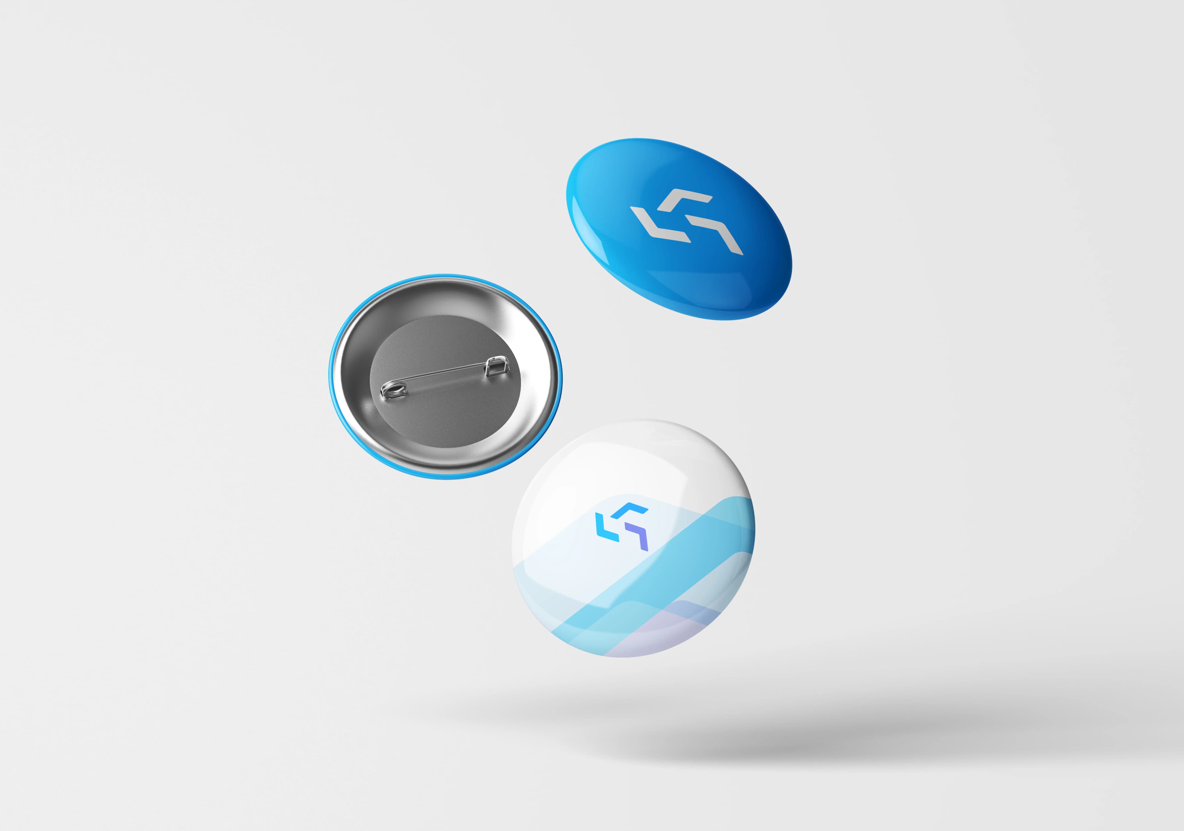
A cloud-service identity has to cross screens and real scale. The website and digital product test hierarchy and rhythm in an information-rich environment; building signage tests legibility at distance and in context; badges, ID cards, envelopes, tote bags, and pins test consistency at frequent, close-range touchpoints. These applications validate the adaptability of the design language, not unverified launch outcomes.

05 / DESIGN METHOD
Design principles
The value of the system is not simply a finished logo. It establishes visual rules that can continue to work:
- A brand symbol should generate a system, not only work at one size
- Sub-brands should inherit a clear identity grammar while retaining product-specific distinction
- Only real tests in interfaces, architecture, and everyday material reveal how an identity behaves at scale
Next Case
TASTY→