
Industry
Data Visualization / Event Operations
Role
Lead UX Designer

EVENT OPERATIONS
One screen for shared event operations
Designed for the National Games safeguard command scenario, this screen needed to support multiple roles during event preparation and operations. The goal was not to show more data, but to let people in a high-pressure, shared viewing environment quickly see whether the operation is normal, where an issue is, and what deserves attention next.
I brought scattered venue, personnel, equipment, and event signals into a shared situation view: the map supplies spatial context, panels communicate operating state, and alert color is reserved for exceptions that need immediate attention.
01 / REFRAME THE PROBLEM
From information density to command judgment
The original concept placed maps, lists, charts, alerts, and navigation side by side. Each module carried information, but together they did not form a clear judgment path: object relationships were hard to read, normal and exceptional data competed for attention, and the map could become little more than a backdrop. The redesign began with two priorities: situation before objects, and exceptions before detail.

02 / SPATIAL SITUATION
Make the map the command coordinate
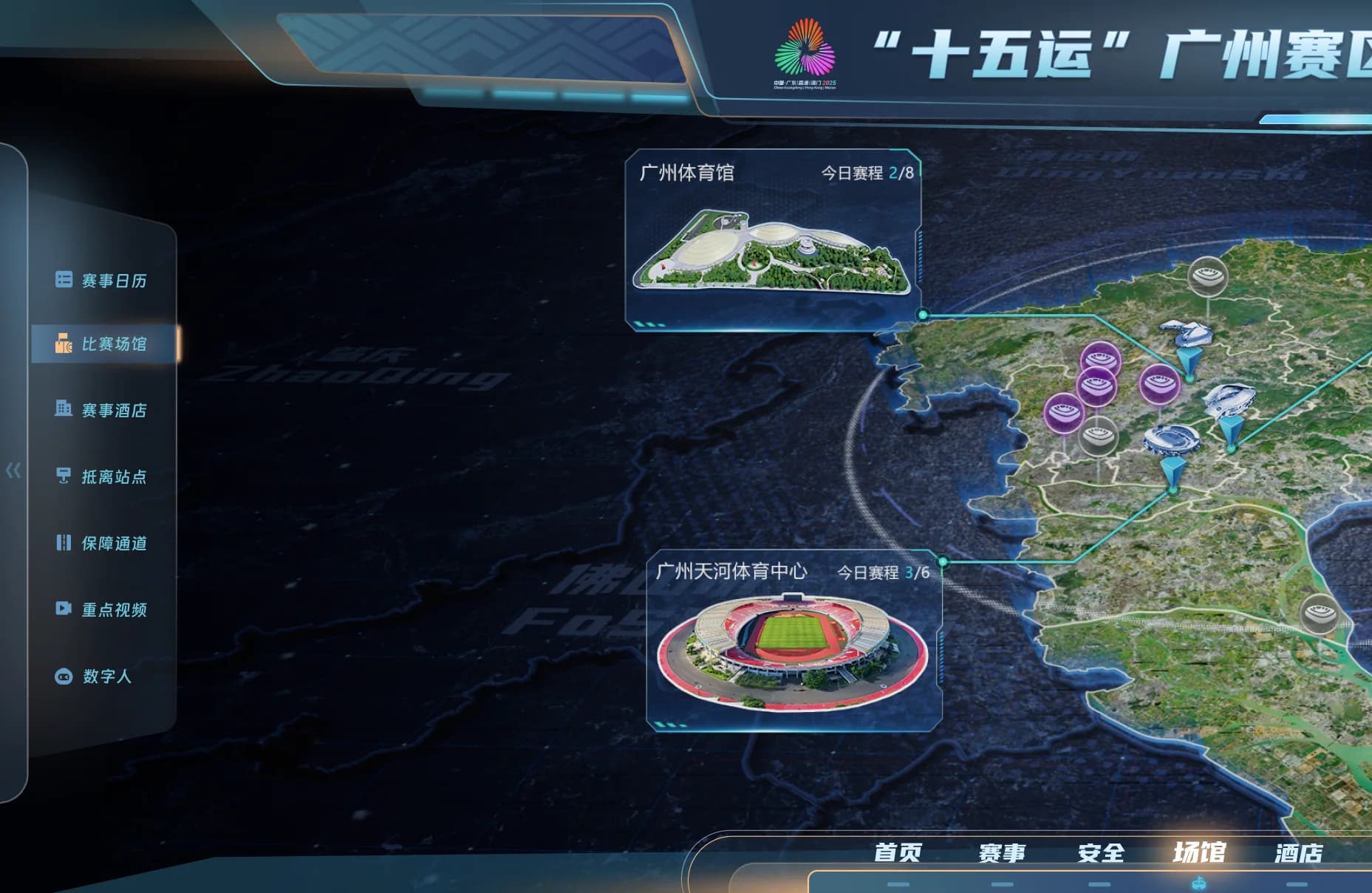
The event-area map is no longer visual background. It becomes the shared coordinate for venues, priority objects, safeguard resources, and event locations. Venue cards connect location, operating state, and schedules, helping users move from regional context to a specific place and then to the object that needs review.
03 / DATA HIERARCHY
Make panels serve attention and decisions
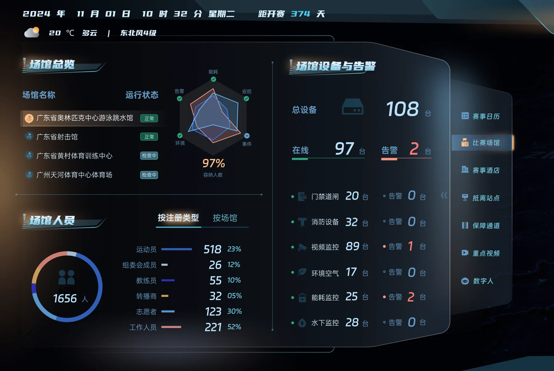
The left side focuses on venues and personnel, the center holds the overall operational situation, and the right side covers equipment and alerts. Each panel answers status first, signals priority second, and reveals detail only when users need to trace it. Limited red and orange mark exceptions so alerts rise naturally above the dark geographic base and regular blue-green information layer.
04 / DESIGN METHOD
A command screen is not enlarged data
The value of a command screen is in arranging attention, not simply increasing information density. This work reinforced three principles: organize the screen around a task chain rather than data tables; return diverse signals to shared spatial objects; and build hierarchy for distant, mid-range, and close reading. In an event setting, a sense of technology comes from coherent spatial order, motion hierarchy, and restrained color, not indiscriminate glow.
- Organize the screen around a task chain: overview, locate, verify, respond
- Unify diverse data through spatial objects: venues, equipment, people, and events return to a map location
- Design hierarchy for viewing distance: identify situation and exceptions from afar, relationships at mid-range, and detail up close
05 / DESIGN OUTCOME
From monitoring display to safeguard command interface
The final design establishes an extensible language for maps, status, alerts, and panels. It helps a complex event-operation scenario form a shared judgment first, then supports further location and verification, while providing one interface framework for later venue, lodging, transport, and security views.
Next Case
GreenHole→