
Industry
Brand Design / Healthcare
Role
Brand Designer
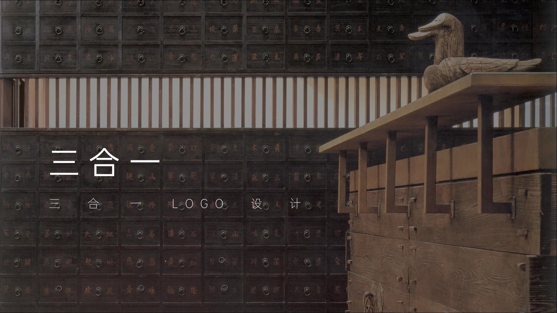
NAMING AND IDENTITY DIRECTIONS
Give a visible name to the collaboration of three capabilities
Sanheyi is a naming and identity exploration for a Chinese medicine health brand. The work did not begin by drawing an oriental symbol. It began by giving a complex collaboration a name: leading Chinese medicine specialists, operations specialists, and internet capability working within one brand.
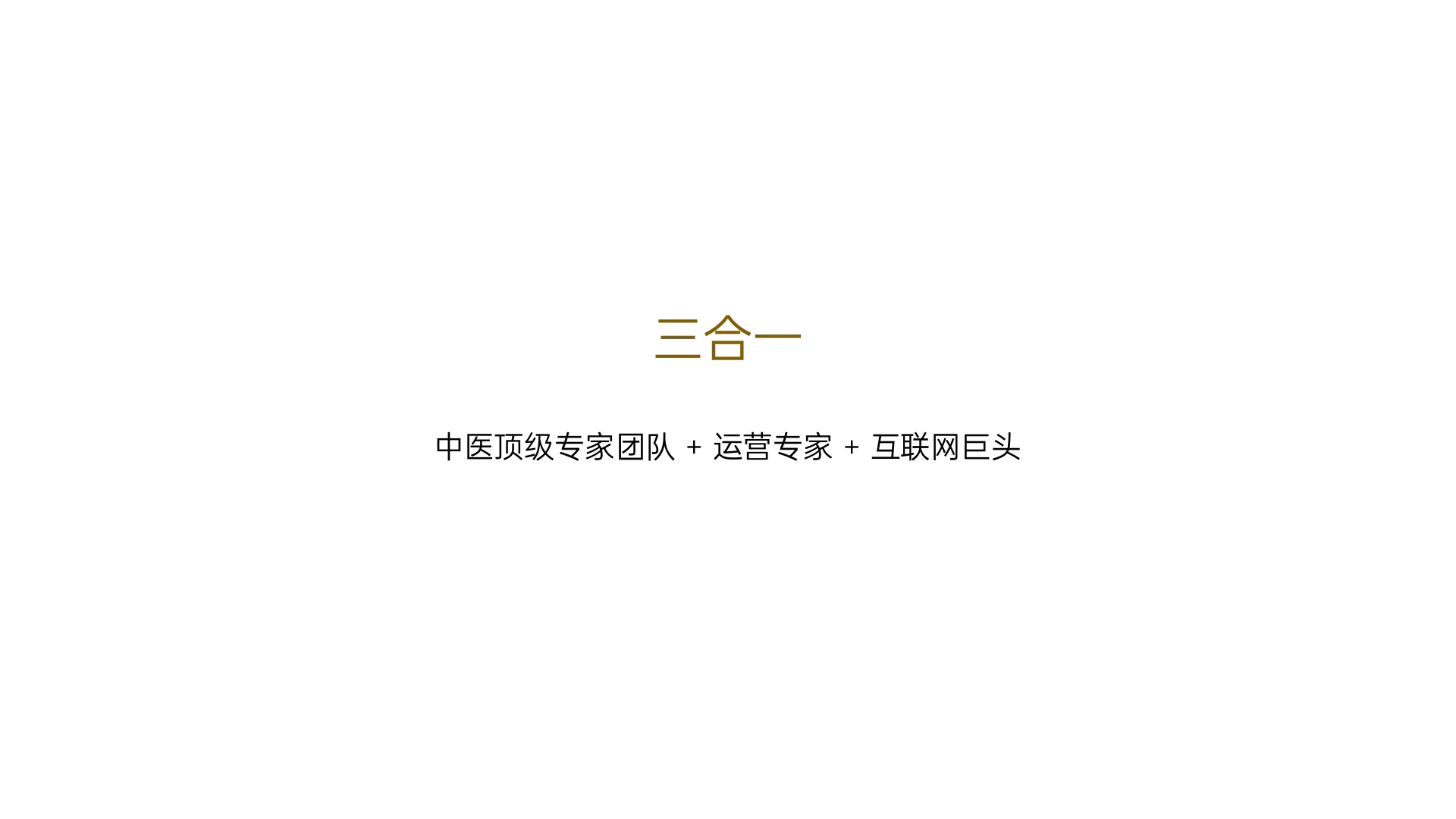
Sanheyi, or Three in One, compresses those three capabilities into a name that can be remembered, communicated, and designed from. Starting with the themes of Chinese medicine, premium expertise, and the internet, the work develops three identity directions and tests their presence in clinical environments.
01 / NAME
Let the name explain why the brand exists
Sanheyi is not a generic integration slogan. It states the brand structure directly: clinical expertise, operational maturity, and internet capability together form its service foundation. The Chinese name preserves a concise eastern cadence, while Three in One makes the collaborative relationship quickly legible across languages. The name defines the collective before the visual system gives it form.
02 / BRAND BRIEF
Turn Chinese medicine, premium expertise, and the internet into design conditions
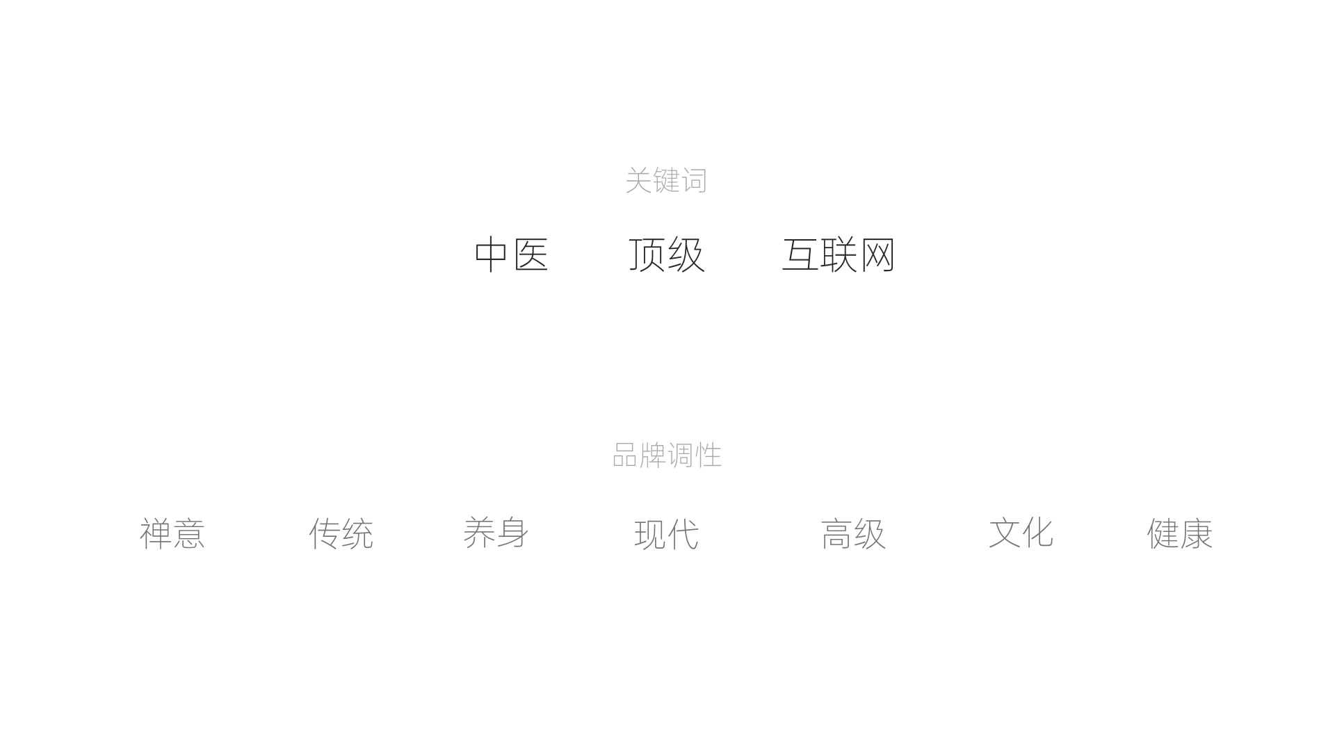
The keywords establish a direction and a tension. The brand needs tradition, wellness, and cultural resonance, but also modernity, quality, and clear healthcare service. Rather than drawing every word as an icon, the identity directions use them as criteria: can a mark feel approachable, professional, and contemporary at the same time?
03 / DIRECTION ONE
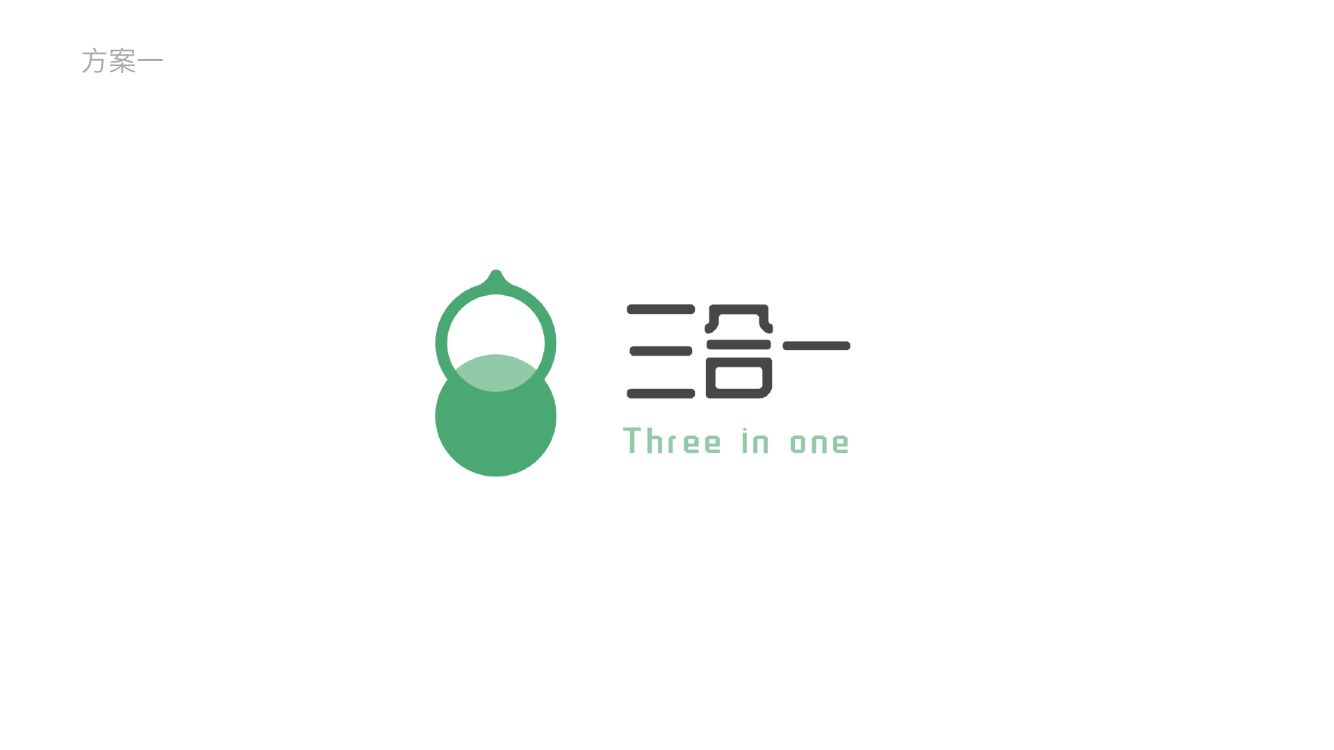
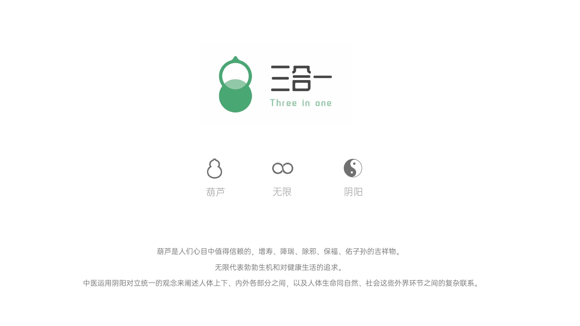
Direction one: use wellness symbols to build gentle trust
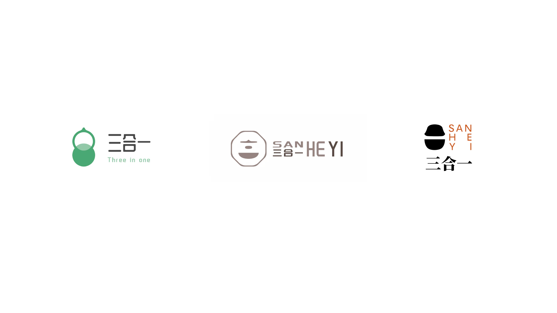
The first direction brings together three cues: the gourd, infinity, and yin-yang. Soft green and rounded geometry speak to wellness and health, while the continuous, balanced structure suggests long-term service and a holistic view. The wordmark stays quiet, allowing the symbol to carry the cultural and emotional signal.
04 / DIRECTION TWO
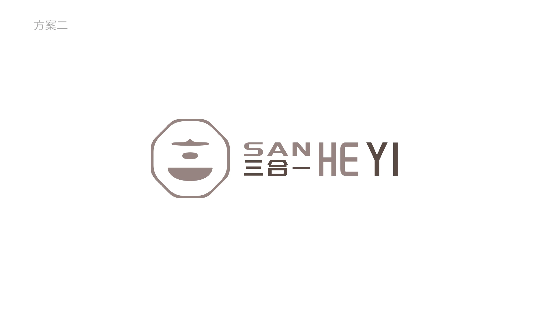
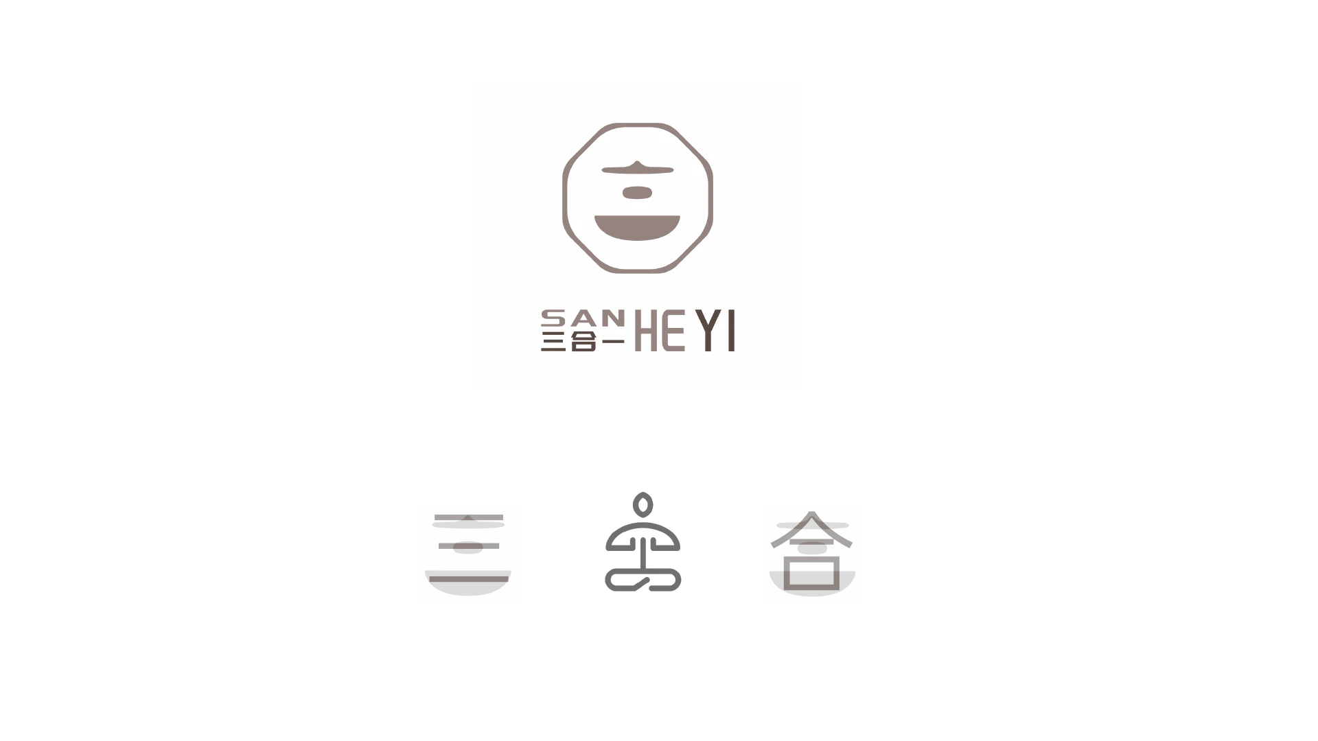
Direction two: establish professionalism through a restrained eastern outline
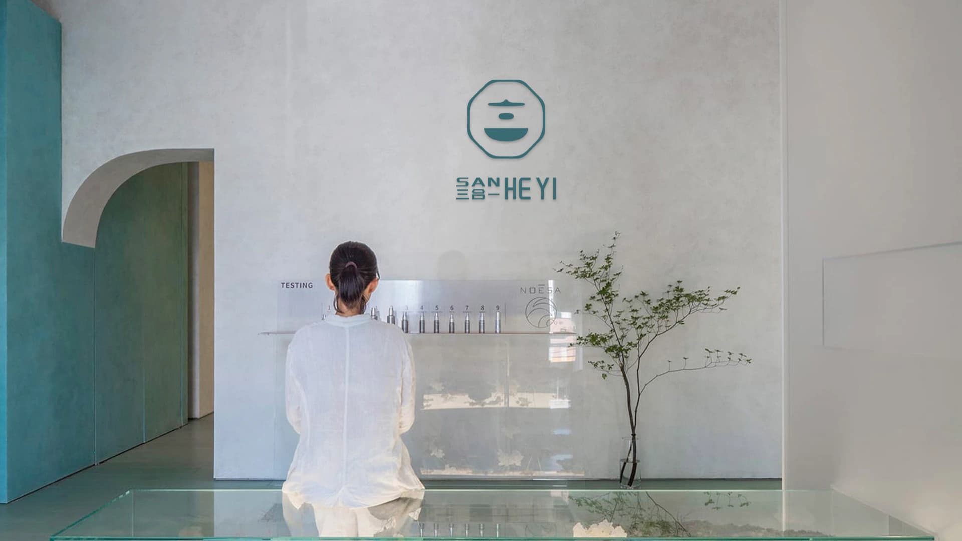
The second direction brings the meaning of he, or union, into a more ordered contour and bilingual wordmark. A rounded frame, stable horizontal composition, and muted color avoid a literal traditional reference, making the identity feel closer to a calm, trustworthy contemporary Chinese medicine service environment.
05 / DIRECTION THREE
Direction three: find a contemporary sense of calm in the negative space of he
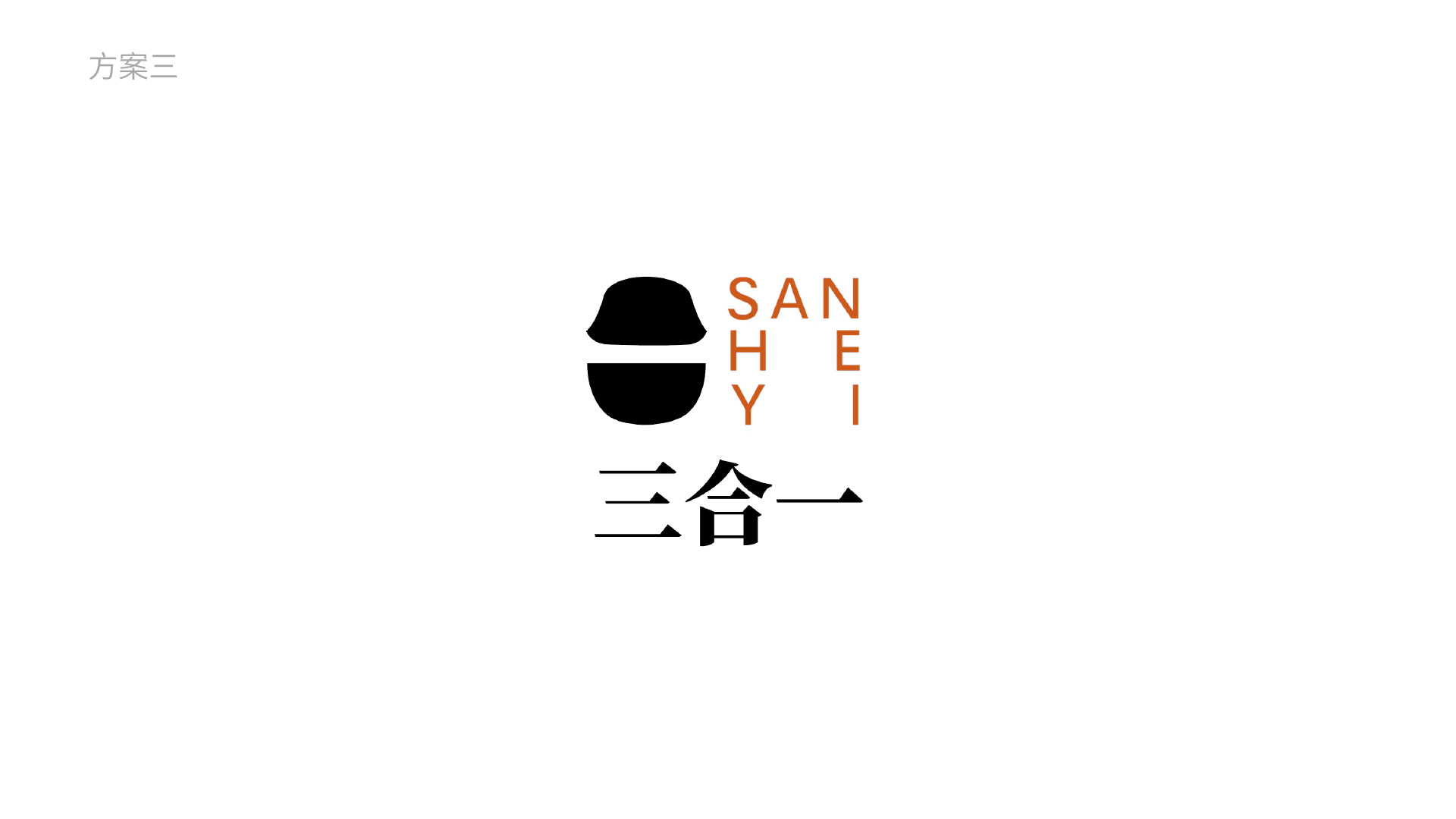
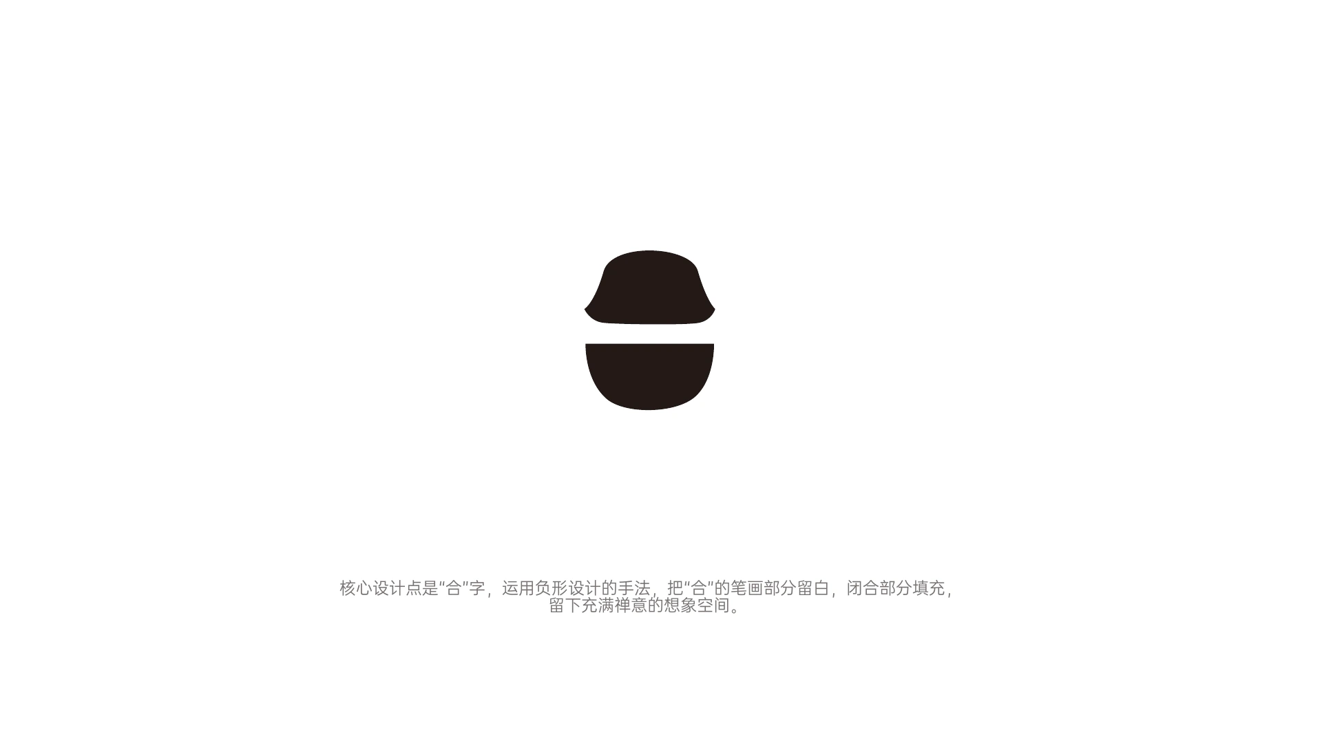
The third direction makes the character he the core. Through negative space and deliberate gaps, open strokes remain empty while closed forms become solid. The mark carries an association with Chinese medicine culture while staying simple enough to be recognized at a glance. Vertical lettering and the black, white, and orange contrast distinguish it as the most contemporary direction.
06 / SPACE AND DECISION
Return the mark to the clinical environment
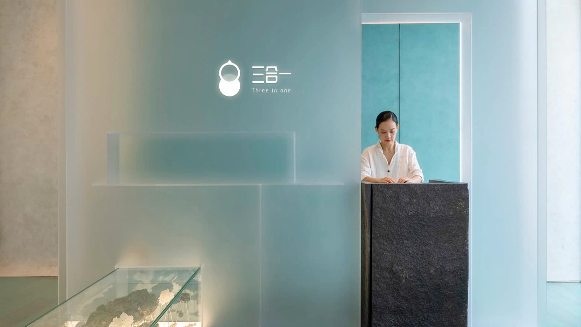
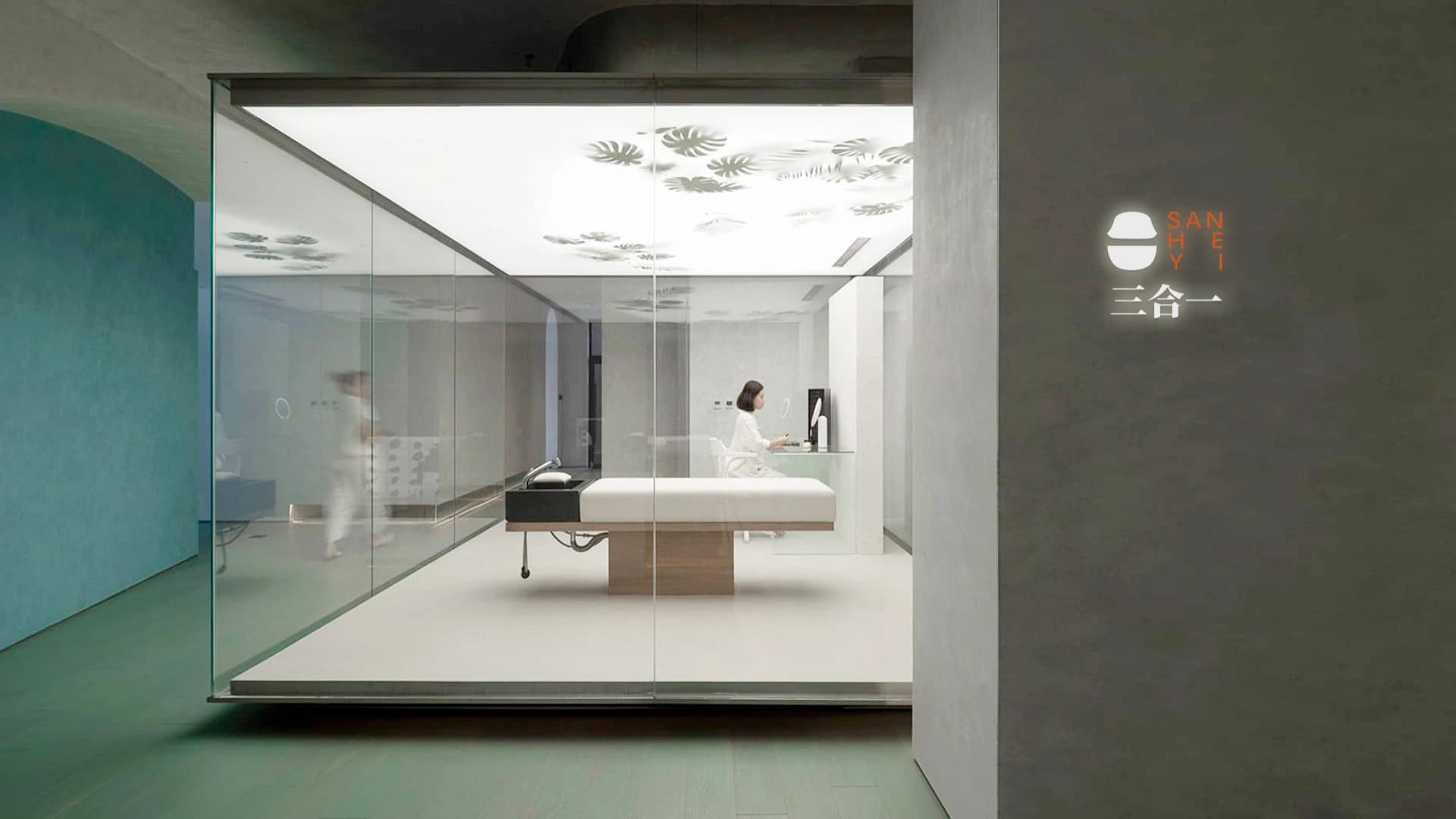
An identity ultimately has to work at an entrance, reception desk, wall, and long viewing distance. These spatial applications are not evidence of launch; they test readability, tone, and the relationship with materials at real scale. They move the question of which direction is better away from graphic preference and toward how people experience a service environment.
07 / COMPARE THE DIRECTIONS
Make comparison a basis for the next decision
All three directions answer the Sanheyi name, but each prioritizes a different quality: gentle wellness, eastern professionalism, or contemporary calm. The comparison page does not force a single answer. It preserves a decision space for the brand to determine which tone should lead its future service experience.
08 / DESIGN METHOD
Design principles
The project establishes a practical approach to naming and identity for a compound health brand:
- Use the name to clarify which capabilities form the brand before searching for visual form
- Treat keywords as criteria for design judgment, not decorative elements to illustrate one by one
- Test identity in spatial context instead of judging it only on white presentation boards
Next Case
Frey Cloud→